Project Overview & The Creative Brief
In 2013, while serving as Art Director at the advertising agency Bates CHI & Partners in Bangalore, I was tasked with developing a high-impact public safety print campaign for the Delhi Police.
The brief demanded a stark departure from conventional, easily ignored government notices. The objective was to create a visually arresting public awareness initiative targeting two critical, life-threatening behaviors on the road: distracted driving due to mobile texting and auditory isolation caused by loud in-car music.
The campaign needed to communicate instantaneous danger across diverse demographics without relying on heavy copy, using immediate, visceral graphic design to spark a behavioral shift.
Visual Language Breakdown
The campaign relies on two distinct visual streams, each utilizing minimalistic yet violent design disruptions to mirror the physical consequences of negligence.
Series 1: The “Texting While Driving” Posters
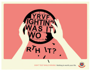
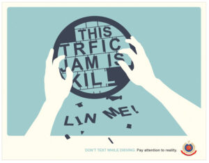
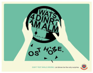
- Color Theory: A palette of contrasting, muted pastel backgrounds (coral pink, mint green, sage blue) offsets the stark black and white foreground elements. This high-contrast pairing ensures immediate scannability on busy roadsides or print media layouts.
- Composition & Typography: This execution merges the physical act of driving with mobile communication interfaces. The steering wheel doubles as a digital text bubble. The typography inside the wheel utilizes fragmented, broken SMS shorthand text (“YRVF IGHTIN?”, “WATS 4 DINR?”, “THIS TRFIC JAM IS”).
- The Design Disruption: The letters physically shatter, breaking through the steering wheel silhouette and falling into the lower frame. The words spell out fatal realizations (“WAS IT WORTH IT?”, “AM ALMOST HOME.”, “KILLIN ME!”). The broken type serves as a direct visual metaphor for a crash occurring mid-sentence, turning language into flying shrapnel.
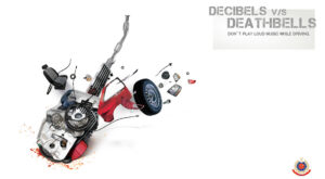
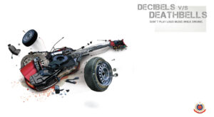
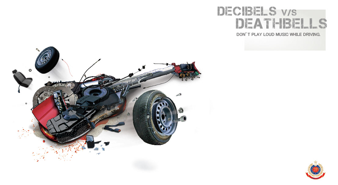
Series 2: The “Decibels v/s Deathbells” Posters
- Composition & Hierarchy: Switching from flat vector minimalism to high-fidelity object deconstruction, this series addresses in-car auditory distractions.
- Visual Strategy: The design seamlessly morphs car components—chassis panels, tires, exhaust pipes, and seats—with the broken bodies of musical instruments like electric and acoustic guitars.
- The Design Disruption: The violent explosion of the vehicle/instrument hybrid represents how loud music deafens drivers to external hazards, blending the concepts of high decibels and fatal impacts. The crisp, clean white background forces the viewer to focus entirely on the chaotic mechanical carnage.

Why Choose Mr.Pullamballi?
I translate complex behavioral psychology into elite, award-winning custom visual branding and public-facing collateral. Whether you are a corporate brand looking to overhaul your identity or an organization launching a high-stakes awareness campaign, we design for maximum impact, engagement, and retention.
Looking to elevate your brand’s visual storytelling? Hire a graphic designer from the creative designer in Bangalore and Kerala today. Let’s build something unforgettable.