Project Overview & The Creative Brief
In 2017, while operating as a Creative Consultant at the brand strategy and creative consultancy Vertebrand, I partnered with Creative Directors Devesh Desai and Prashant Ramamurthy to engineer a multi-layered print campaign for Munix Scissors.
The creative brief required us to position Munix not merely as a utilitarian household cutting tool, but as an instrument of precision, empowerment, and structural transformation.
We developed a two-pronged visual strategy to address different facets of the brand’s tagline: “Giving shape to ideas!”
- The Social Impact Series: Posited the physical act of “cutting and replacing” as a conceptual tool to reshape reality and solve socio-economic challenges.
- The Artistic Precision Series: Highlighted the razor-sharp physical performance of the product through intricate, layered paper sculpture art.


Visual Language Breakdown
The campaign seamlessly bridges raw, real-world documentary photography with hyper-crafted studio layouts.
Series 1: Reshaping Reality (Social Narrative)
- Composition & Metaphor: This execution uses a clever “cut and replace” graphic overlay on poignant, human-centric photographs.
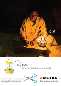
- Ad 1 (Education): A young boy studies diligently in a dimly lit environment, illuminated only by a primitive oil lamp. A dotted scissor line tracks around the flame with a direct prompt:
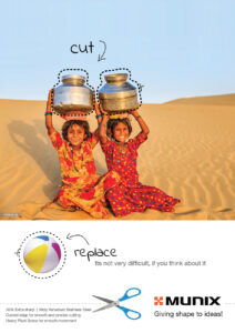
cut. Directly below, a modern, rechargeable LED lantern is markedreplace, followed by the poignant line, “Its not very difficult, if you think about it.” - Ad 2 (Resource Accessibility): Two young girls smile amidst an arid desert landscape, balancing heavy, traditional metallic water pots on their heads. The scissor line tracks around the heavy vessels to
cutandreplacethem with a playful, lightweight beach ball—contrasting a harsh daily chore with the carefree childhood they deserve.
- Ad 1 (Education): A young boy studies diligently in a dimly lit environment, illuminated only by a primitive oil lamp. A dotted scissor line tracks around the flame with a direct prompt:
- Typography & Execution: By combining high-end product specifications (“30% Extra sharp | Moly Vanadium Stainless Steel”) with a minimalist vector layout of the scissors slicing through the copy block, the design transforms a product feature into a message of societal transformation.
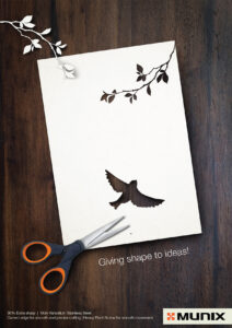
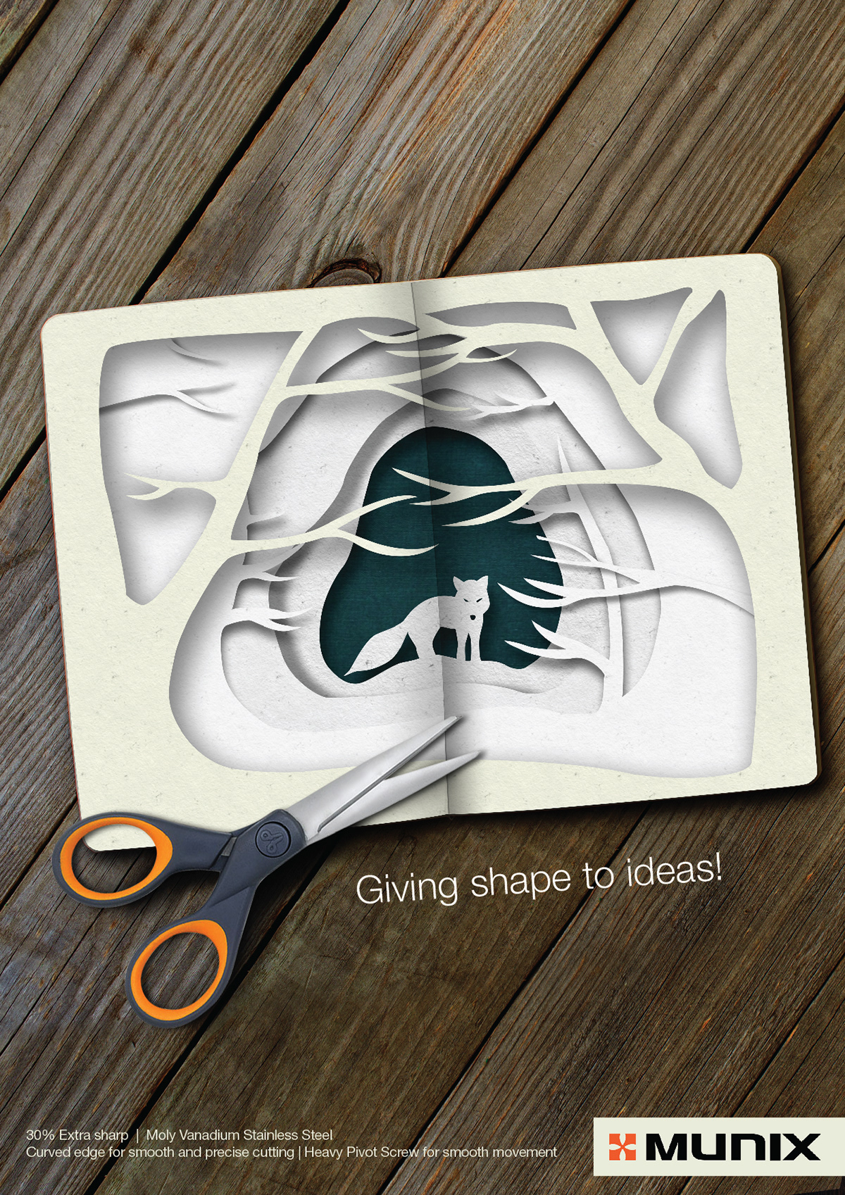
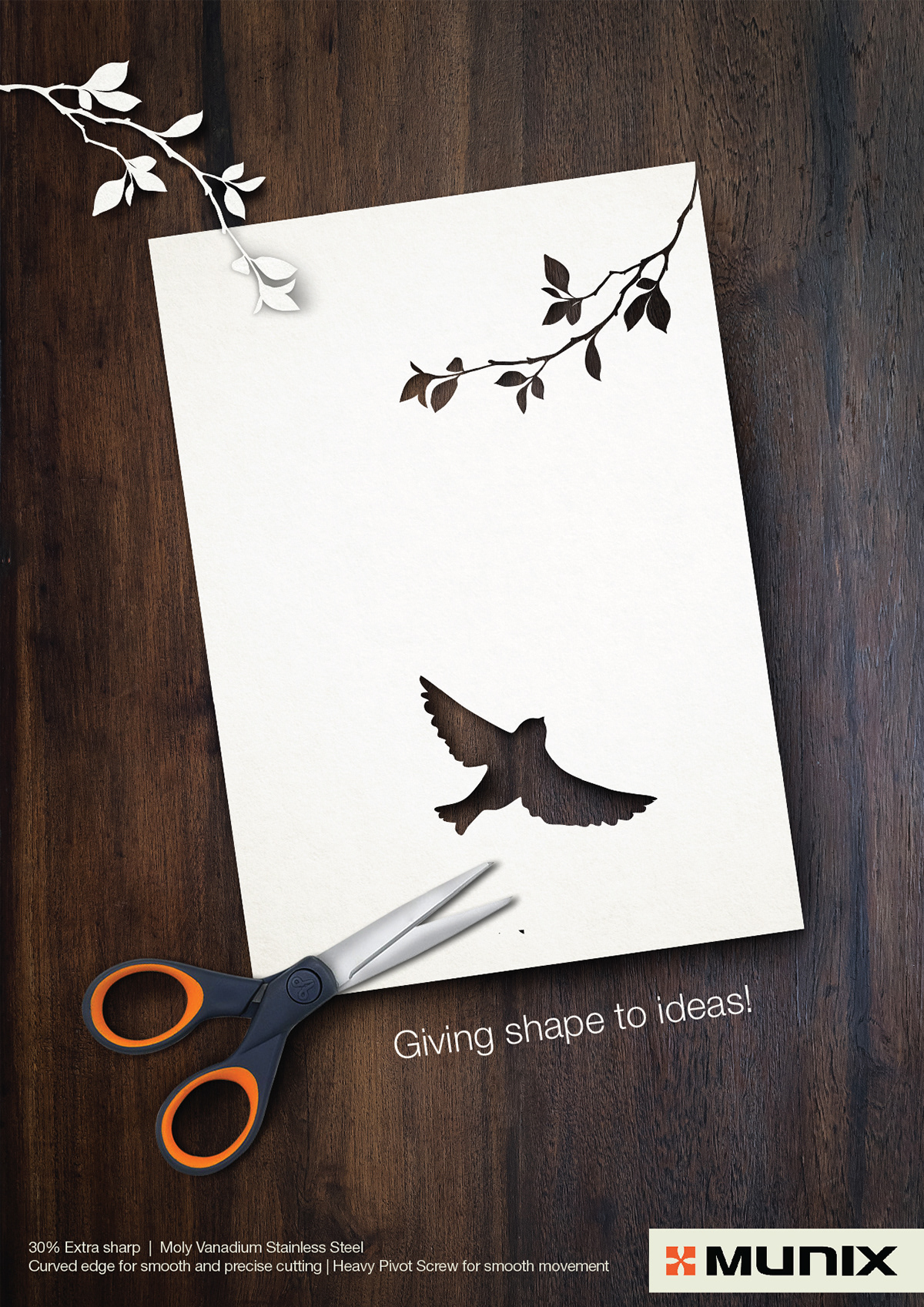
Series 2: The Art of Precision (Craft Identity)
- Color Theory & Textures: This execution relies heavily on warm, tactile, organic textures. Rich, dark-grained wooden tabletops serve as the canvas, creating a high-contrast foundation for stark white paper stock.
- Composition & Depth: These layouts show the scissors resting directly on top of intricate paper cutouts, proving the tool’s flawless execution.
- The Fox Layout: Features a multi-layered, three-dimensional paper diorama tunnel that carves out a dense winter forest, revealing a solitary fox at its center.
- The Bird Layout: Exhibits a clean, single-sheet silhouette cut where a bird has been cleanly excised from the paper, leaving its negative space behind while delicate, leafy white branches cast soft shadows across the page.
- Design Strategy: The depth of field, delicate drop shadows, and flawless negative spaces emphasize the product’s technical superiority—specifically targeting designers, artists, and high-precision craft professionals.
Why Partner with Pullamballi?
I believe that great design doesn’t just display a product—it shifts perspectives. From high-concept print campaigns to corporate brand identity overhauls, our studio infuses raw human insight with technical graphic mastery to drive real commercial equity.
Ready to give shape to your brand’s biggest ideas? Hire a graphic designer